
Withum is a forward-thinking, technology-driven advisory and accounting firm, helping clients to Be in a Position of Strengths in today's complex business environment.
The Challenge
Withum is mostly known for being an accounting firm, however they have grown and became a multi-faceted entity. Being a multi discipline firm created issues with the website; some services seemed more important than others, very complex website, a lot of overlapping content and more.
When a decision was made to redesign a website we decided the best strategy would be doing it in phases. First came research, we wanted to know:
Who uses the website? (new/returning users)
How many user groups are there?
What does the user journey’s look like?
Stakeholders point of view.
Role: Research & analysis, Information Architecture, Wire frames
Team: Jr. Ux designer, art director, project manager, dev team
PROCESS
Since withum.com is an extra large website, we had to make sure we covered it from all aspects. The research methods we used were:
Heuristic audit - to help us stay unbiased, this was our first action item on the research journey. Part of the audit included:
ADA audit
CRO analysis
Website crawl
Competitive/comparative analysis
Stakeholder interviews - included 9 interviews with ‘C’ level stakeholders, as well as niece leaders. It was no surprise that we had very different opinions about the website, and what had to come next. What they all agreed upon however was that the website is hard to navigate.
User surveys - were sent out to a select number of Withum’s clients. The response was immense, what we learned was that most existing clients don’t use the website, but want too.
Card sorting exercise - 4 different card sorting exercises produced very similar results. to make the findings clear, we have turned the sorted cards groupings into dendrograms.

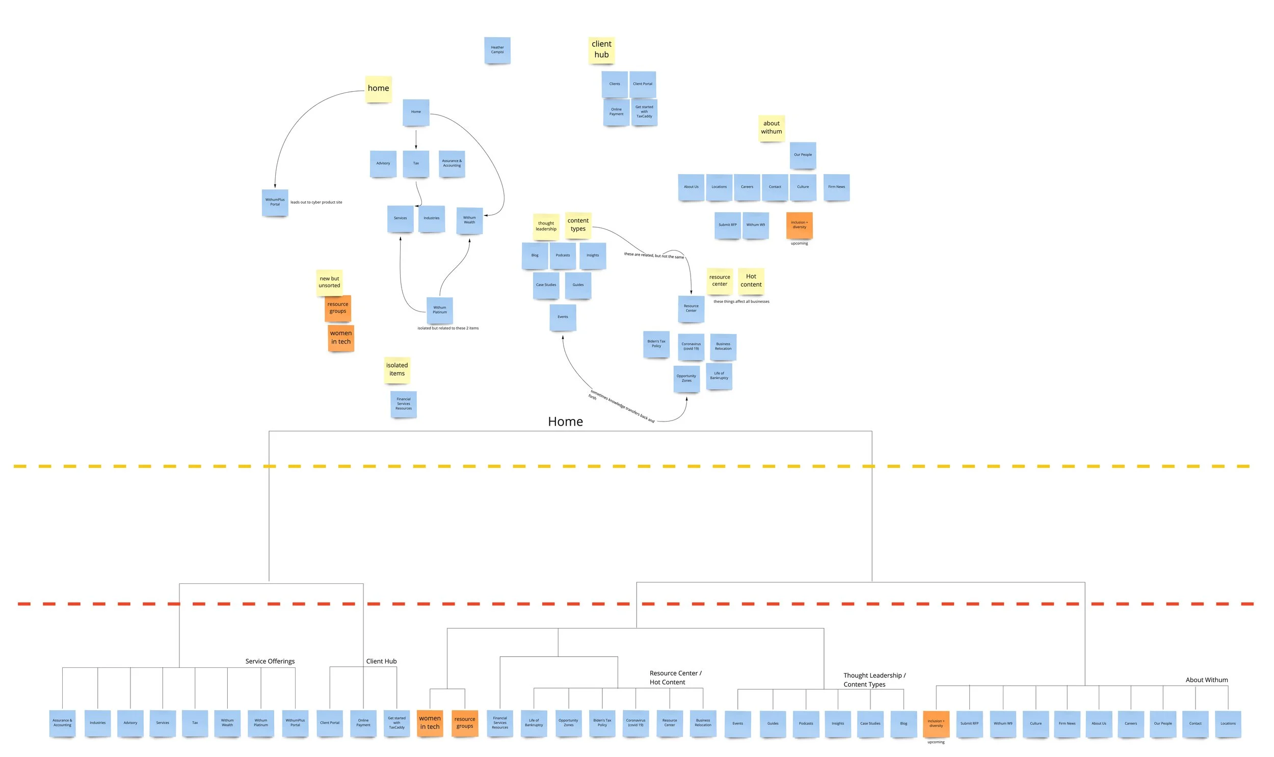
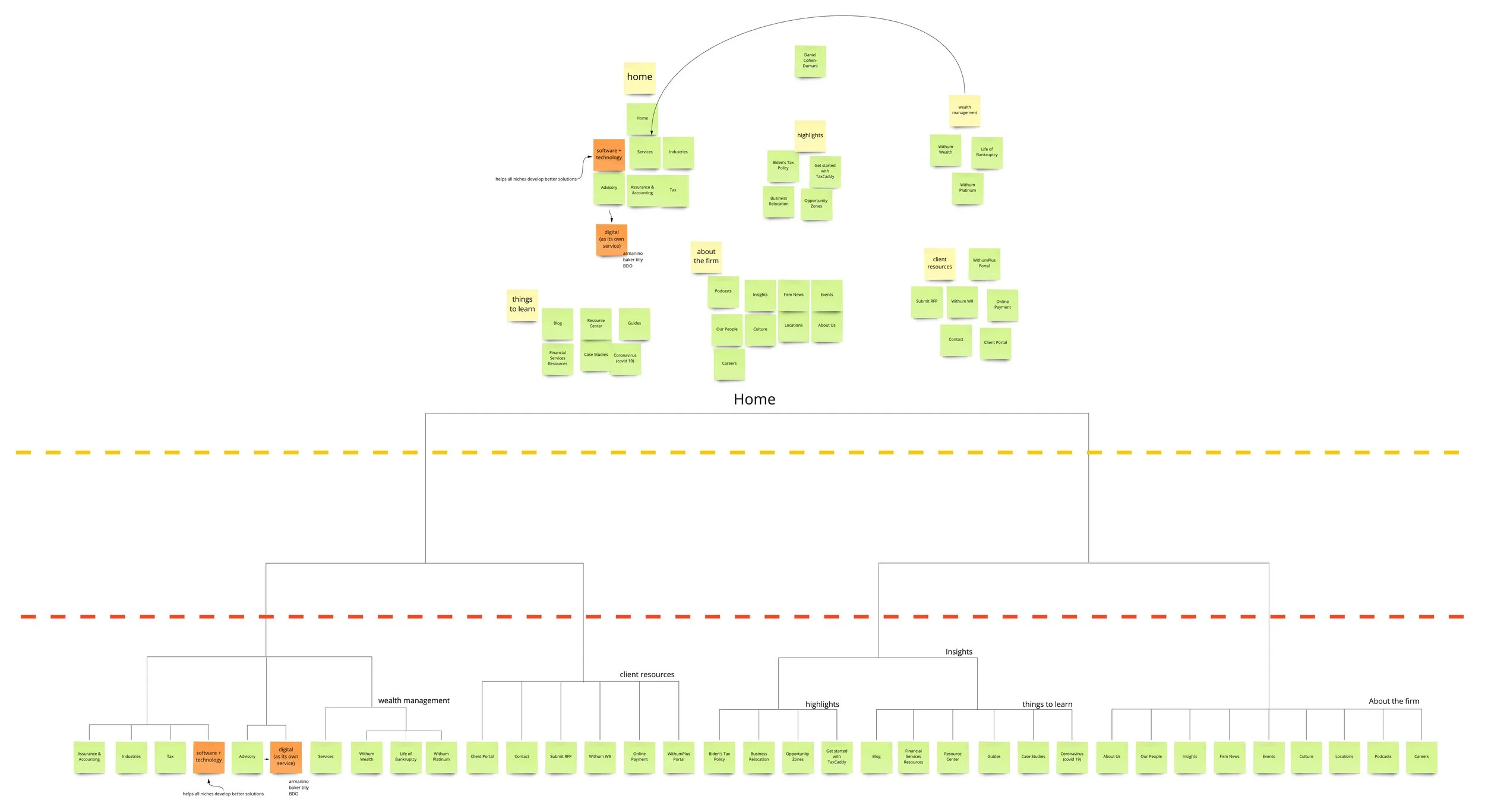
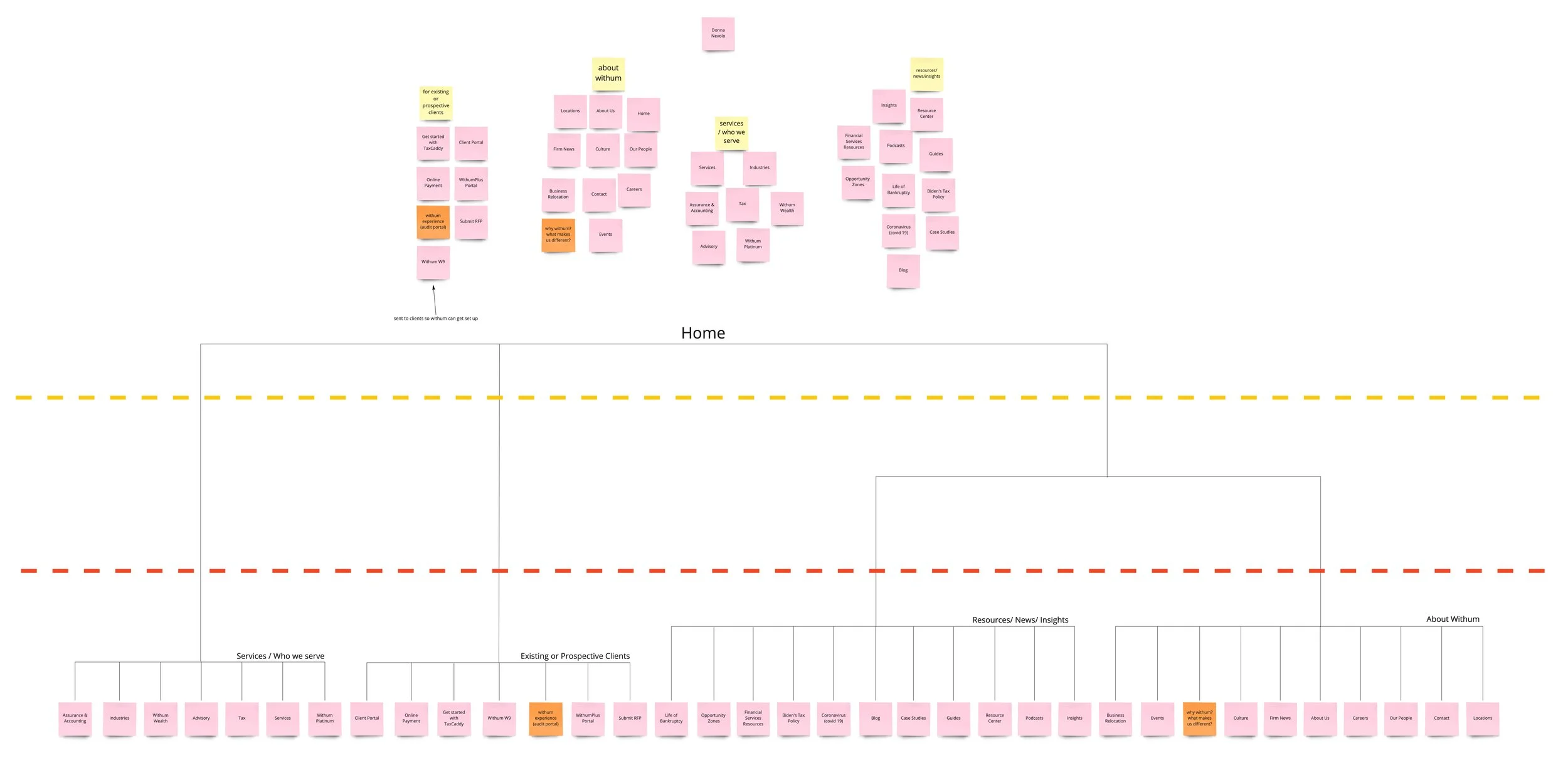

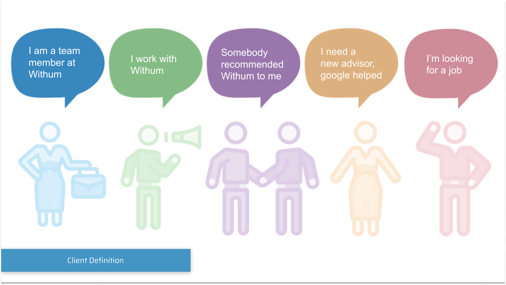
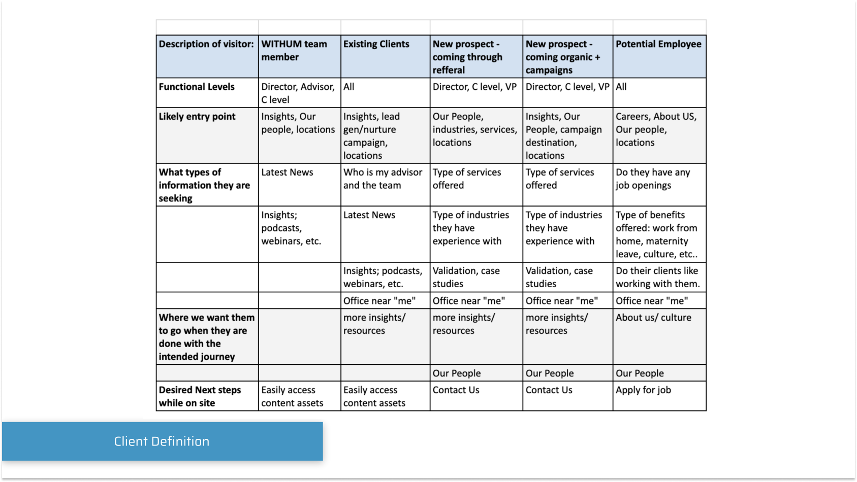
User Definition was key to being able to build the right structure. 5 archetypes were identified:
A Withum team member
Existing Clients
A New prospect - coming through a referral
A New prospect - coming organically
Potential employees
The main research components that helped us identify the archetypes and their journeys were first and foremost, the customer surveys that were sent out and had quite a god response, however from my years of experience as a Designer I learned to trust but verify, and so I used Hot Jar to follow users scroll depth, click and heat maps with the combination of Google Analytics to analyze where traffic comes from, what paths users take, how long do they stay for, and where do they normally drop. All that information lead me to able to craft
It became evident that a significant issue existed—an abundance of content cluttered the platform, resulting in redundancy, excessive wording, and content competing for attention. With numerous pages to sift through, customers faced challenges in locating their desired information. It appeared as if Withum's services were working at cross-purposes rather than complementing one another. Even stakeholders themselves struggled to find information organically and often had to resort to sending direct links to customers.
The solution for the project's success became evident: a comprehensive overhaul of the Information Architecture was imperative.
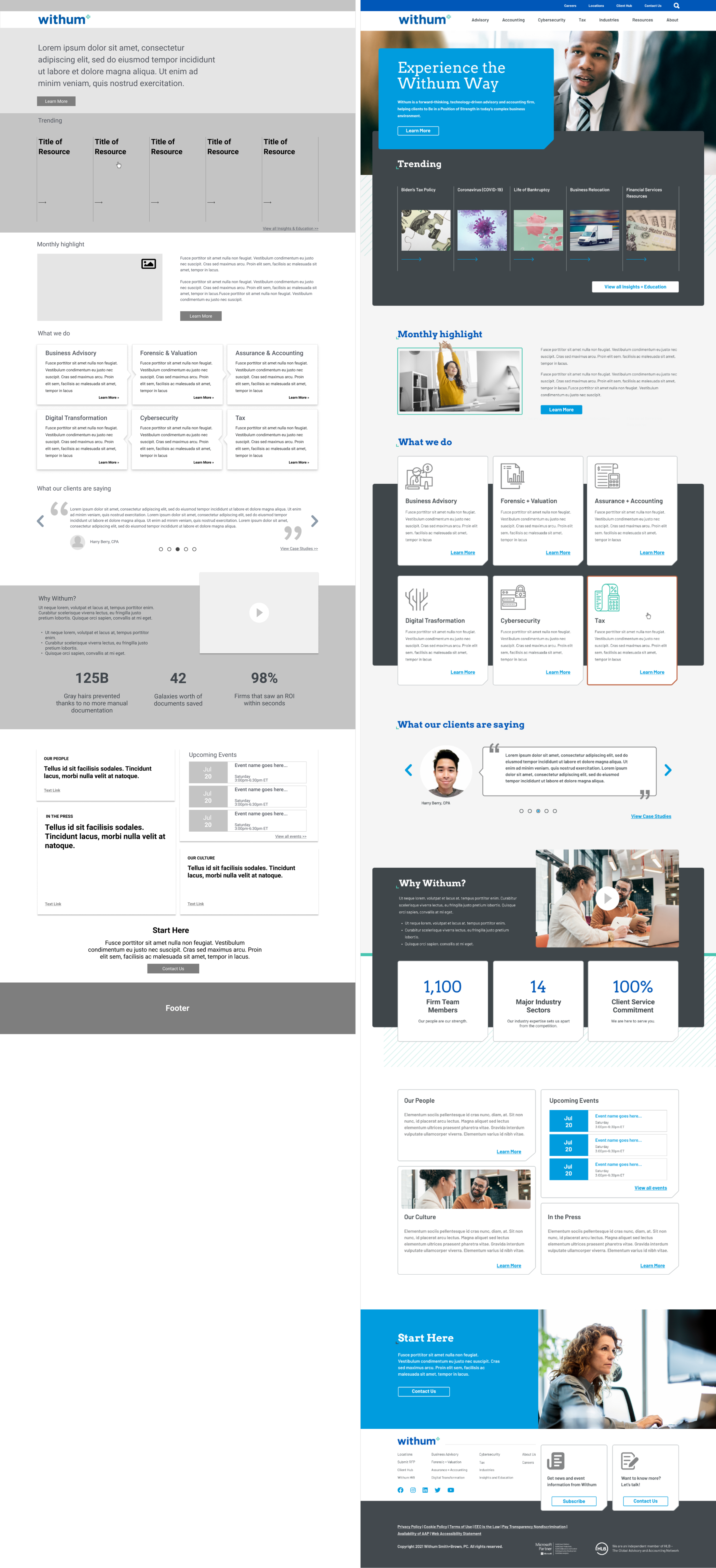
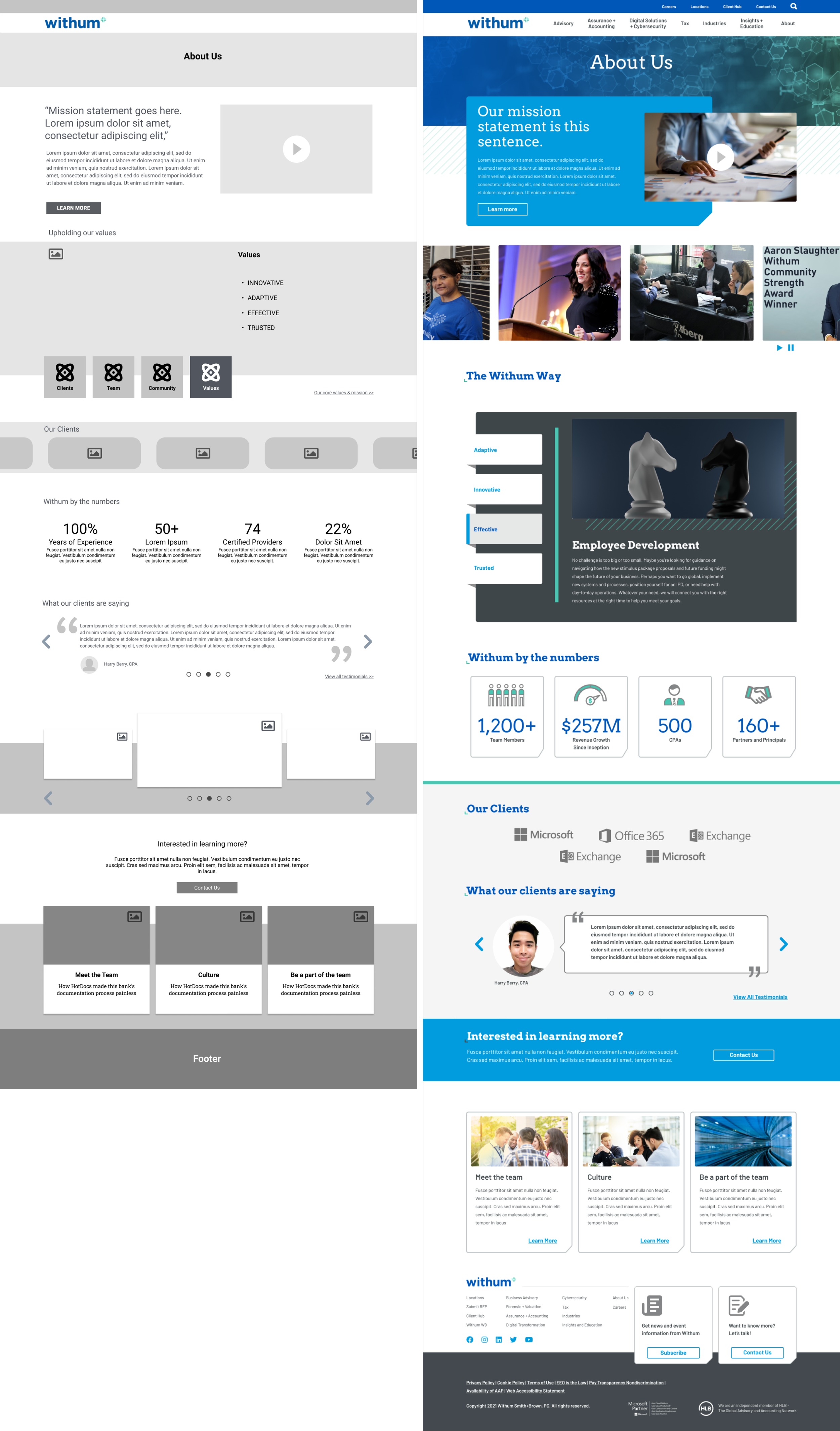
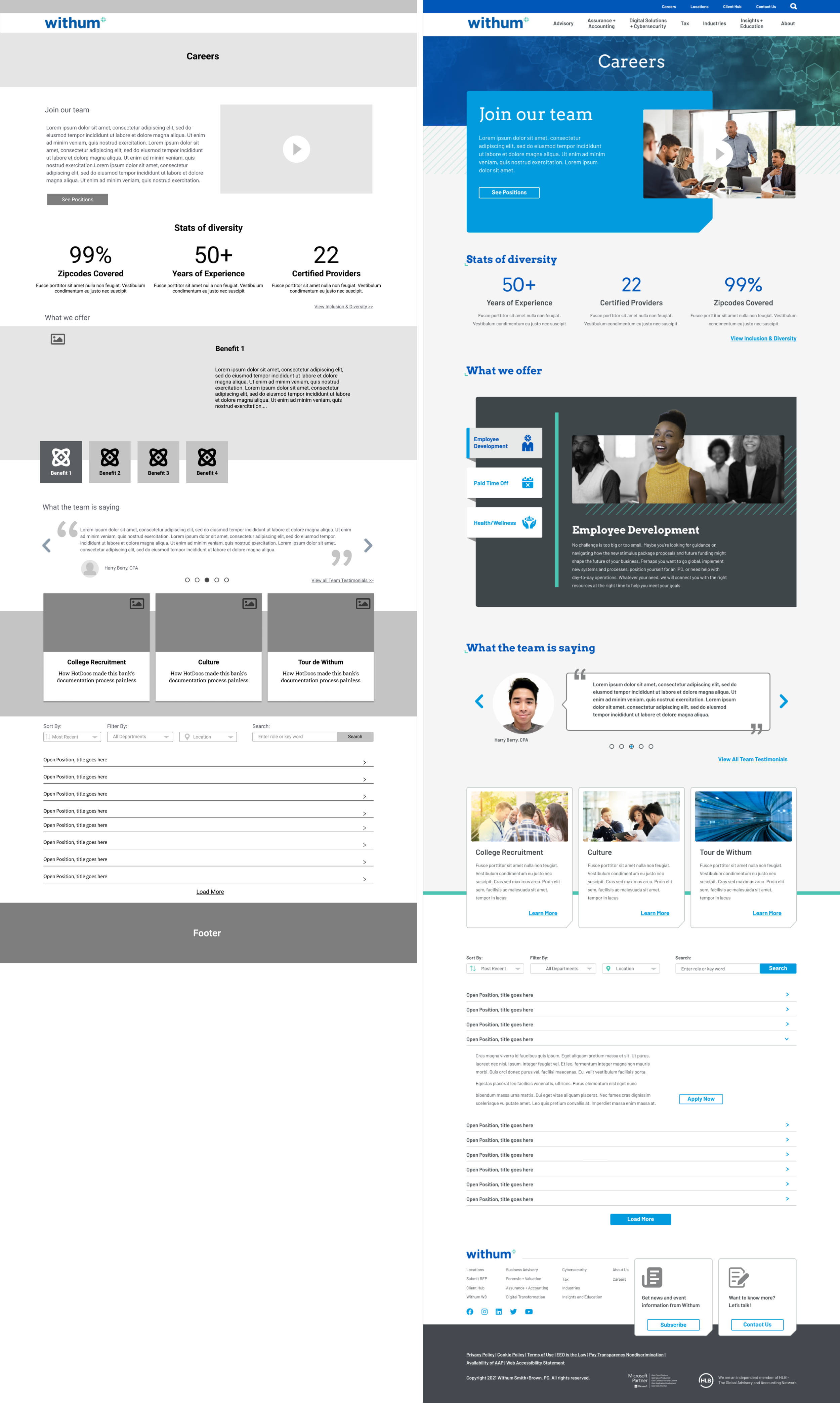
All previously duplicated and triplicated pages on the website were streamlined.
Information was categorized into four primary groups aligning with Withum's customer information needs.
The introduction of a mega menu was a pivotal step, simplifying customer navigation and ensuring a seamless and enjoyable journey to their desired destination.
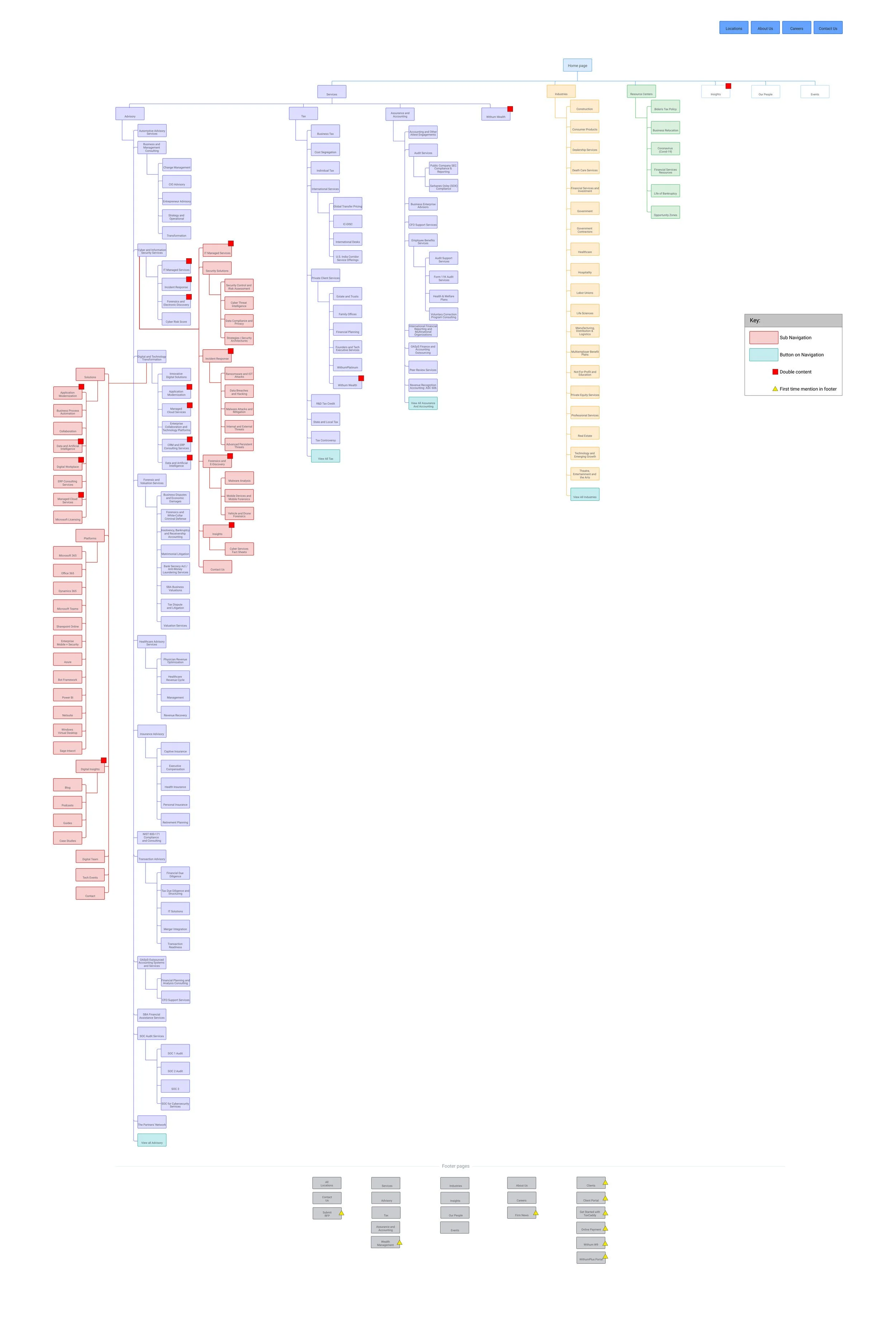
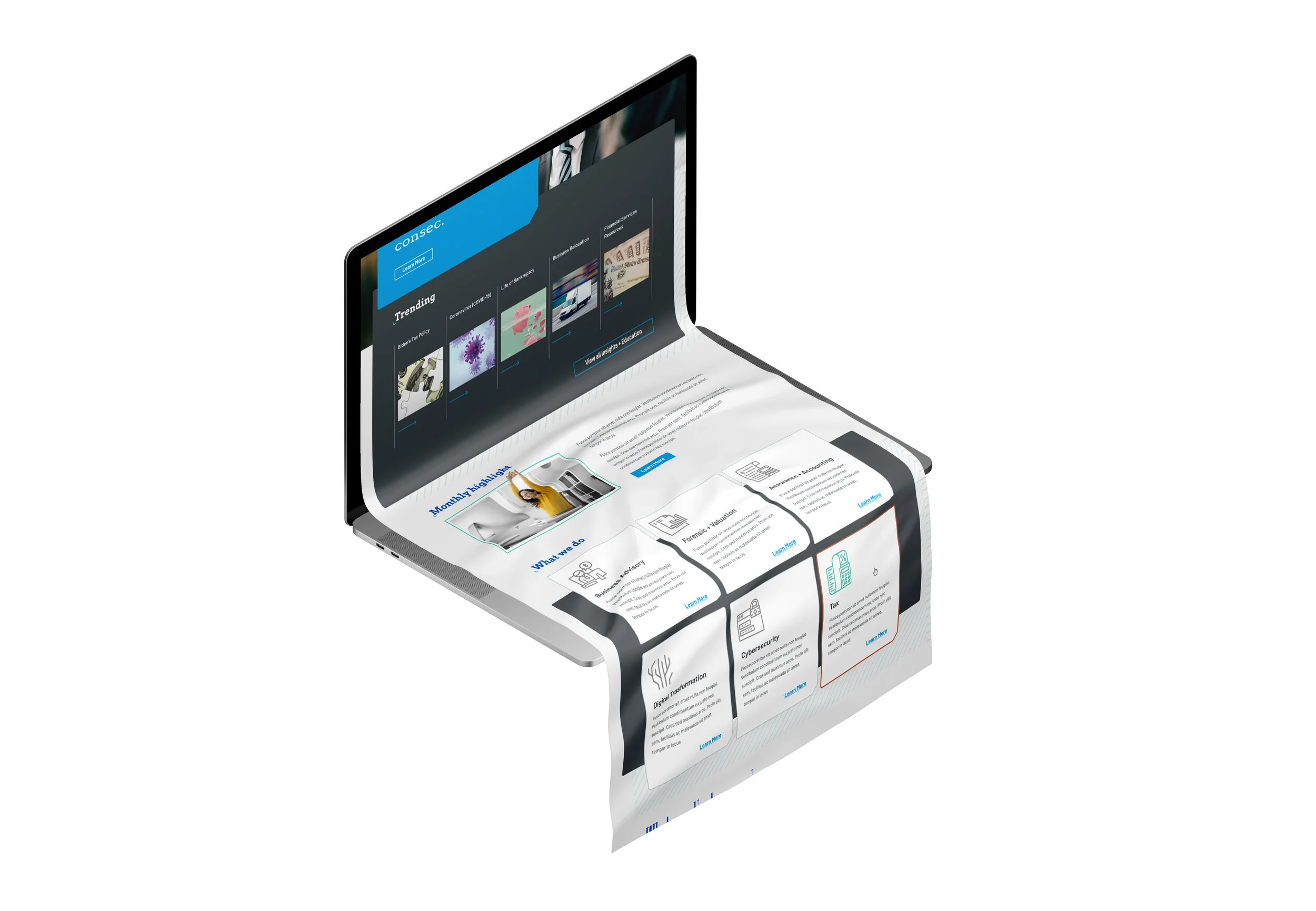
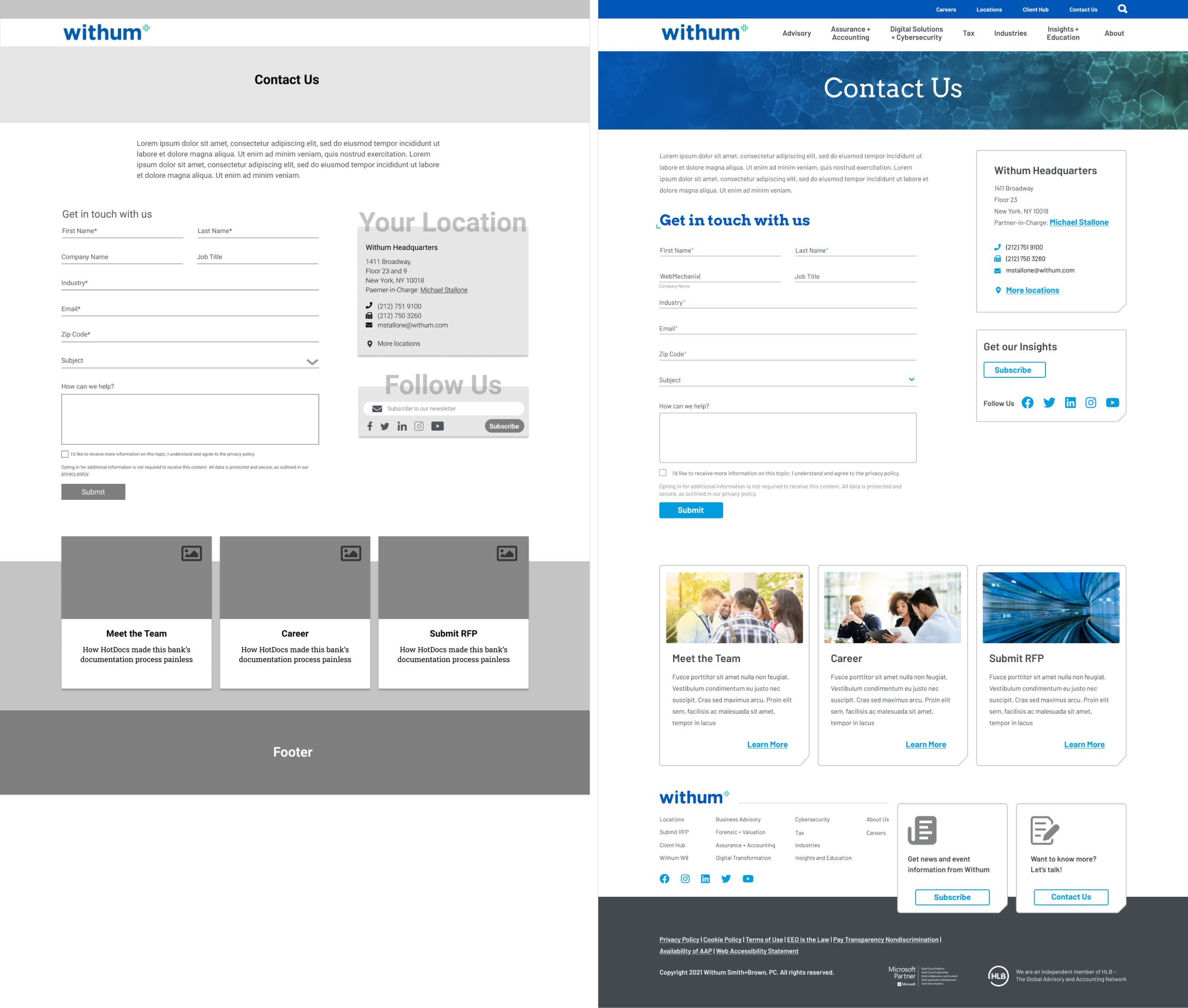
Before
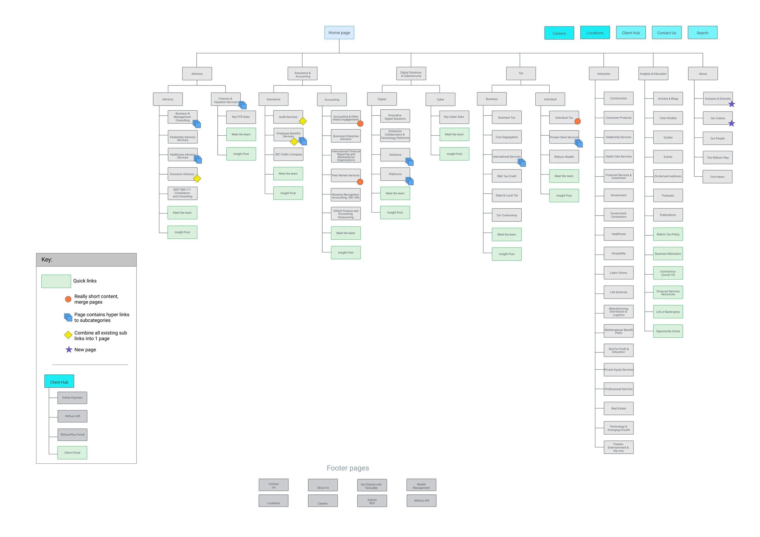
After
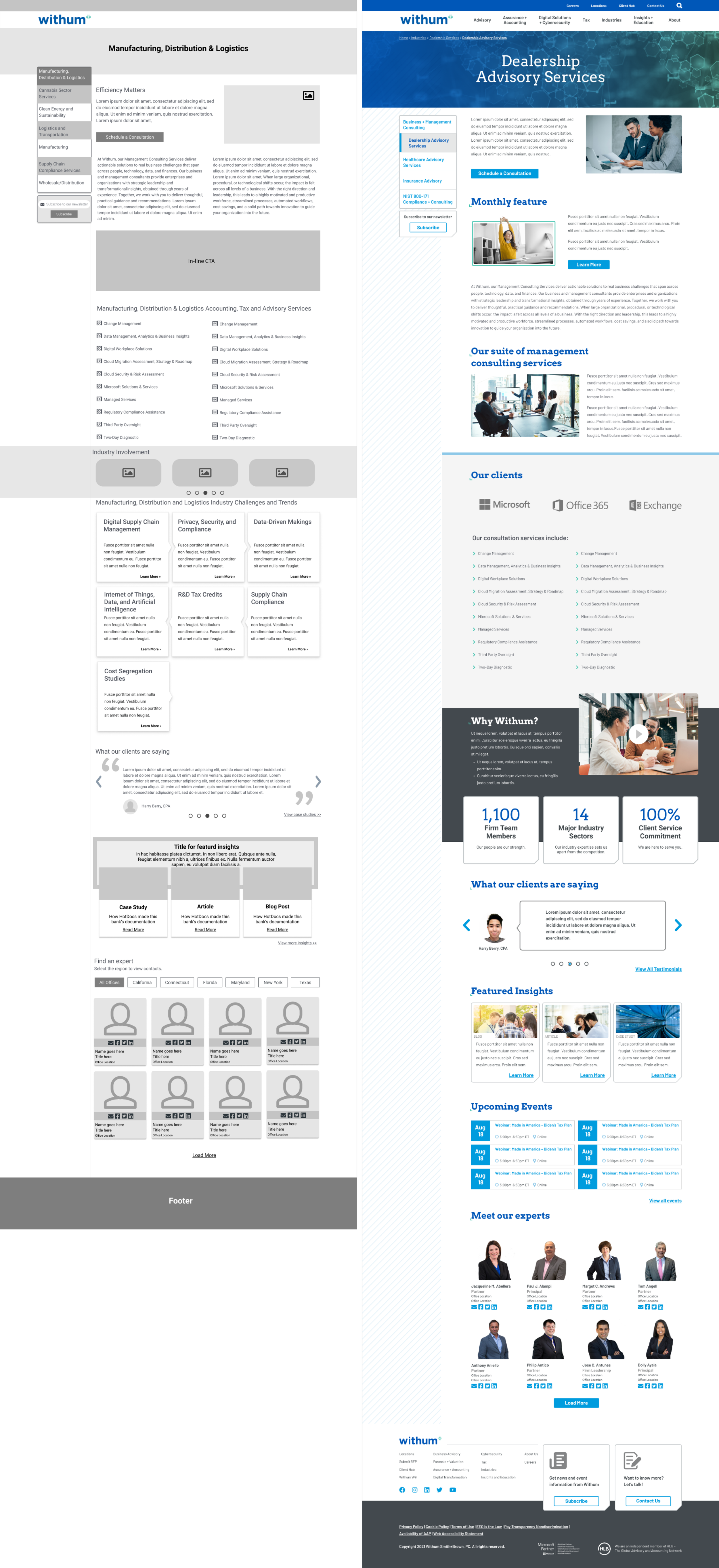
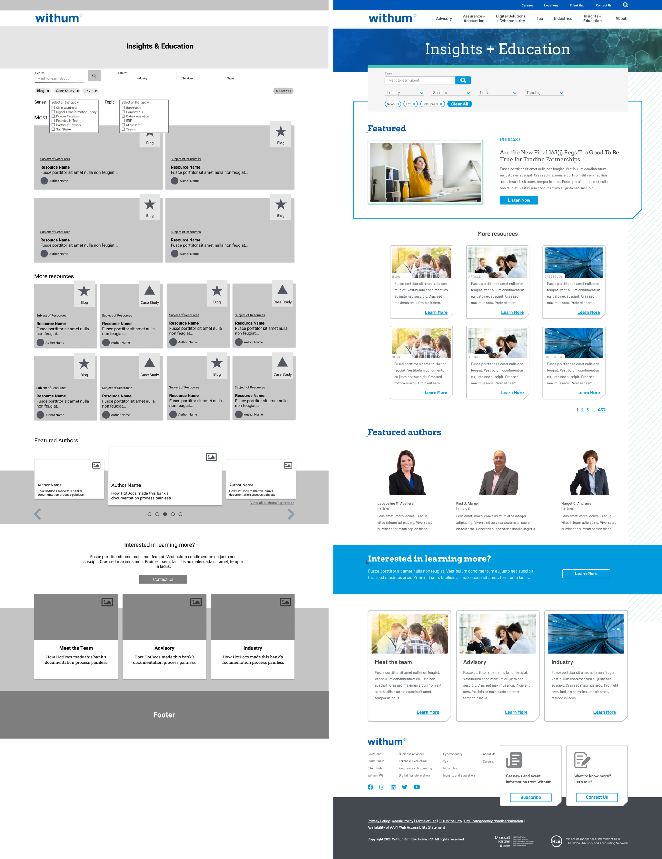
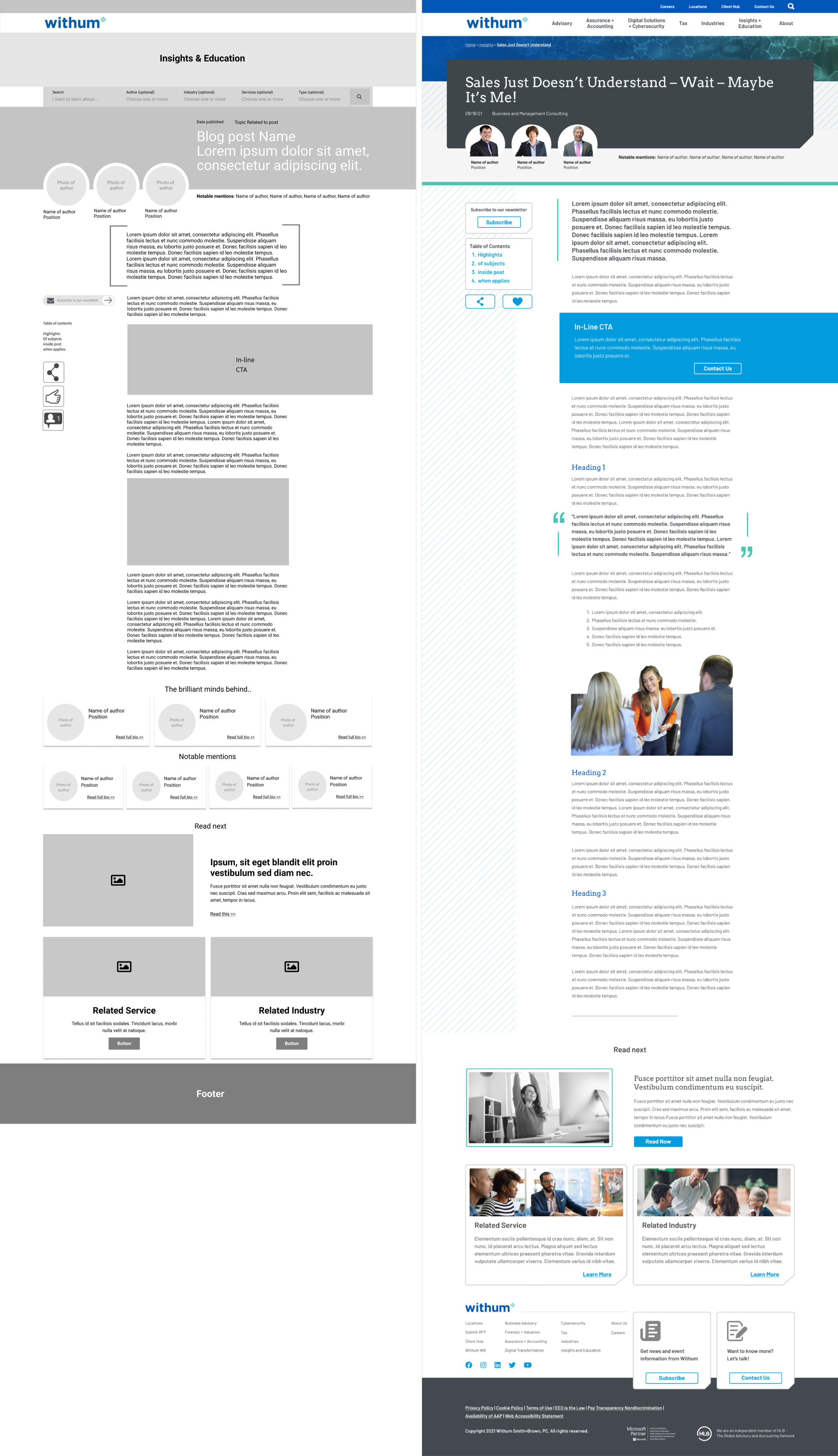
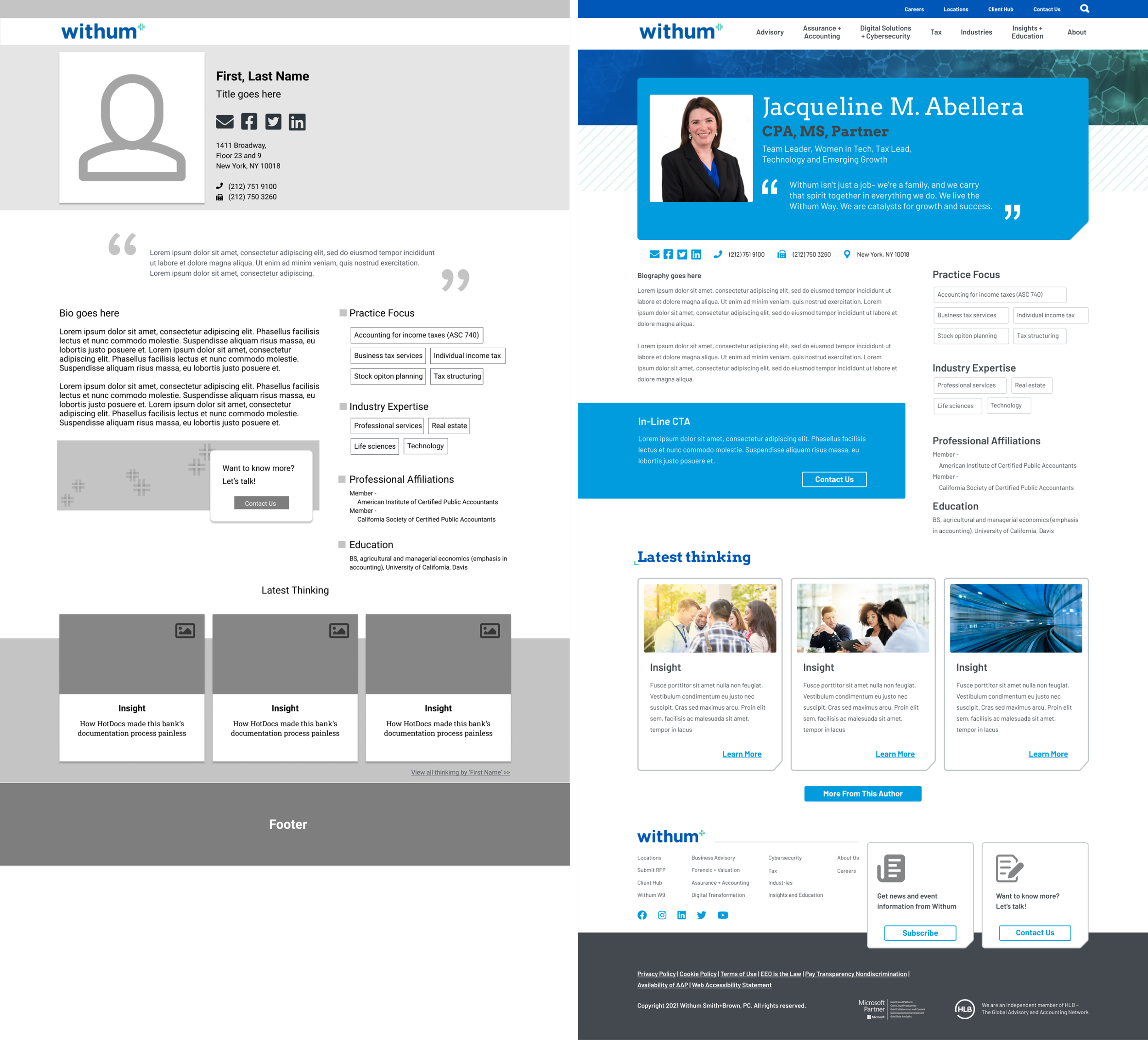
WIREFRAMES & MOCKUPS
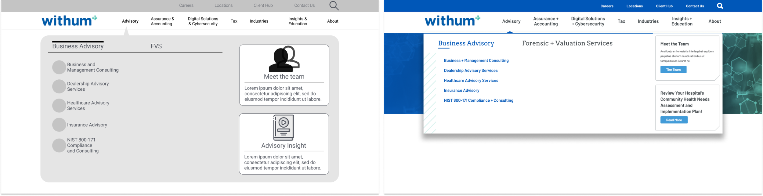
A pivotal aspect of the website redesign is the 'mega menu,' which breaks down information into digestible chunks to combat information overload. Furthermore, incorporating hyperlinks to team members and pre-filtered insights is a game-changing feature, aligning with user preferences identified through research.
It is incredible how the right information structure with the right components to represent them can tell the right story for each individual customer.
RESULTS
Aligned the menu to their current business landscape
Achieved a 90% accessibility score that’s more than compliant - a major improvement from before and much higher than the industry standard.
Page speed, Core web vitals
Look and feel - applied brand guidelines
Launched the site and immediately saw an increase in traffic
33% increase in sessions from Jan 13, 2022 - March 13, 2022 vs Nov 14 2021 - Jan 12, 2022
Organic performance not only didn’t drop but it increased as well
38% increase in sessions from Jan 13, 2022 - March 13, 2022 vs Nov 14 2021 - Jan 12, 2022